By Kelly Rogan, on 20 February 2019
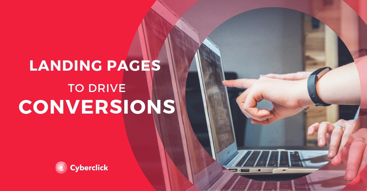
Whatever you do in your online marketing strategy, one thing is very clear: if you want to increase conversions, you need a landing page.
The landing page is a basic pillar essential to guide users in the conversion funnel, from casual visitors to loyal customers. It is probably the element that can most influence your conversion rate with just a few simple changes, so it is always worth spending all the time and attention that are necessary. Let's see what exactly is a landing page and what are the keys to increase conversions with them.
The landing pages are a crucial element in email marketing campaigns. For most marketers this is where the magic happens. A design that suits every type of device can work wonders, getting consumers to react positively to the call to action - that is, that request have been asked to perform at signing a newsletter, download an eBook or buy a product. By this we mean that it is totally necessary that the landing pages are responsive.
What Is a Landing Page?
A landing page is a unique page of your website that seeks to convert a visitor into a lead, that is, a user who has provided their data to a company and therefore becomes a record of their database, making it possible for the company to continue interacting with him.
For example, suppose that user X has visited an article of the company's blog and where the advantages of online marketing for small and medium enterprises are discussed. At the end of the article, there is a link that invites the user to find out more.
Struck by curiosity, user X clicks on the link and is on a landing page where the ebook "Guide to online marketing for small and medium enterprises" is offered. This page explains to the user how this ebook can help achieve business objectives and you are encouraged to fill out a form to download it for free. If you follow this step, user X will receive the ebook in his email and it will have become a lead for company Y.
A fundamental characteristic of landing pages is its simplicity. In general, they include only the essential elements and are focused on a single function: to capture users who have clicked on an AdWords ad for a specific offer, to get attendees to an event, etc. Landing pages, in short, are essential within many types of strategies, such as email marketing or inbound marketing, and should be taken care so that they really convert well.
As for the key ingredients to how to increase conversions with a landing page, we can distinguish the following:
A valuable offering. Landing pages that convert, provide things that customers really value. In this way, users are incentivized to leave their data with the company. A value offering on the landing page is therefore essential to create a sense of mutual exchange.
A unique URL. Landing pages are unique pages within the company's website and therefore have their own unique URL. Ideally, it should be optimized to be easy to remember and respond to the SEO strategy.
An outstanding title that sums up the offer.
An image or video that shows the product or its benefits for the user.
A copy (text) that focuses on detailing the offer. Ideally, it should be based on the benefits for the end user and not on the characteristics of the product.
A form for the user to leave their data.
A call to action button to confirm the transaction (event registration, download, etc).
10 Keys to Increasing Conversions with Landing Pages
1) Pay Attention to Detail
Virtually all companies that do online marketing have landing pages, making standing out, not so easy.
If you want to convert more with your landing page, pay attention to detail. Evaluate specific details separately considering: high quality graphics, the value of your offering, clean and attractive design, creative texts and a touch of originality.
Take into account that the landing page will be integrated into the web, so it has to respond to the design parameters of the brand.
2) Pay Attention to Titles and Subtitles
Often, a quality title makes the difference between inviting a user to stay, or provoking a user to leave within just a few seconds.
An effective title will get the user's attention and convince them to keep reading. Express yourself in your own tone, exerting confidence and creativity along the additional 7 Cs of communication. It is also advisable to distinguish titles and subtitles with a larger letter body, to ensure that these stand out visually.
If the title serves to present your main offer at first glance, the subtitles will serve to highlight and clarify different aspects of your offering, so do not hesitate to use them as necessary.
3) Clarify Offer Conditions
If you want to convert more, the user must know what can be expected from you. A landing page is the right place to explain with clarity and simplicity the conditions or the "small print" of what you offer. Clarifying offer conditions makes the user feel that they can trust you and avoid possible disappointments in the future.
In the same way, it is important to notify the user about follow up step upon inserting their data. Clarify these conditions through phrases such as: "upon subscription, you will receive this ebook free of charge in your mail".
4) Generate Confidence Through Credentials
Providing users with certain credentials are not absolutely essential for a landing page to work, but they can give users confidence in your brands, and so help to increase conversions. A selected few of the following elements of credibility have proven to assure web users:
Logos of brands that already trust your products and services.
Quality stamps from accredited organizations in your sector.
Awards and awards received.
Testimonials and user opinions (maintaining authenticity).
5) Communicate with Images and Video
Here the premise is very simple: include your best photo or video as the main image of the landing page.
In many cases, just that will be enough. If what you are promoting is a physical product, do not hesitate to include a more detailed gallery where you can see the use of the product, different angles, colors and models, etc. Or better yet, a video presentation where everything is explained.
6) Maintain Clarity and Simplicity in Texts
Since text is one of the elements that stands out least visually, sometimes the importance of the text in a landing page is underestimated. Text is the communication means through which the products or services are really "sold", making clarity and simplicity vital.
When writing your text, keep the following premises in mind:
Avoid excess at all costs. Remember that one of the main characteristics of a landing page is simplicity, and this also applies to the texts you write.
Keep in mind the relationship between the text and the image. Ideally, both complement each other and, of course, never contradict each other.
Maintain creativity. You don't have to resort to elaborate metaphors, but creatively crafted phrases have an impact in the mind of the reader.
7) Optimize Your Landing Page for SEO
As landing pages only contain brief texts, sometimes they are not taken into account in the SEO strategy of the website, when in fact they are a very important element. Follow these tips to better position your landing page:
Investigate the keywords that can bring in more traffic.
Optimize page load times.
Includes the keywords in the title, the URL and other relevant places (at the beginning, in the subtitles, in the alt of the images, in bold and anchor texts).
Try to get quality links and visits from social networks.
8) Carefully Design Forms and Buttons
If you want to increase conversions, you have to make it very easy for users to leave their information and click on your form or buttons.
The forms must adapt to the needs of each landing page: sometimes we only need that the users leave us their email, sometimes more data will be necessary to qualify the lead. In any case, look for a color, font size and typography that stand out from the rest.
As for the call to action button, the most important thing is that it looks like a button and that it is clearly visible. You can play with alternative calls to action, such as "Yes, I'm interested" instead of "Buy" or "Download."
9) Test, Test, Test
When your landing page is ready, it will be time to face various tests: show it to your aunt, or a friend who has nothing to do with your sector, and ask them questions. Do they clearly understand what the offer consists of and how to get it? If not, you will have to rethink your design.
But that's not all: once you have a viable landing, continuously run A/B tests of different elements: call to action, buttons, colors, sizes ... Little by little, you will get closer to the landing page of your dreams to increase conversions.
10) Simplicity in Design
When designing a good landing page, less is more. The idea is that the value offering is as clear as possible for the user, and leaves no room for doubt or hesitation. When entering the landing page, it should immediately become clear what the offer is and what value it brings.
Therefore, bet on short texts, white space and a minimalist design in general. Remove all non-essential items, such as the general navigation menus on the page. Continuously look for possibilities to improve the responsiveness and usability.
Responsive Landing Pages
The concept applied to Responsive Web Design seeks to create sites that are tailored to the various visual media that exist today: smartphone, tablet or PC. Thus providing the best user experience possible. It is very frustrating to navigate from your mobile phone and find a static web size that does not automatically fit the screen. This discourages and causes the consumer to leave the navigation within the site. Imagine if that happened to us on the website of our company! It means that just lost a potential customer.
We have to pay special attention to the design of the landing pages so they are adaptive, as this is where the visitors turn into leads or directly into buyers.
More and more people consult their emails from the smartphone and marketing managers must take this factor into account, because when users move from their email to the landing page they will have to find a website that detects what device is being accessed and optimize it for the medium version that’s displayed, rearranging the elements of the web or even discriminating against some of them.
The 3 main reasons why consumers need a responsive landing page are:
- It facilitates good user experience on our site. Surf the Internet from all types of mobile devices, but the smartphone is the most used because it’s what we carry with us everywhere.
- It is best for our business. Our landing pages will be available to all consumers via any device. This means that we provide them the way they respond to the call-to-action or to purchase our products or services. Although the final purchase is usually made from a computer, mobile has helped in the purchase decision process, as it has served as a consultation channel.
- Google requires us to be Responsive. Search engines rankings favor pages with adaptive capacity. In contrast, it penalizes those that remain static and they are relegated to oblivion in the search results.
