By Laia Cardona, on 17 September 2015
Renew or die. This idea is one that many of the large companies we all know have begun to implement. The logo of a company or brand is much more than that. It is, among other things, its image towards others and what you want to be recognized by. Learn how Google and Facebook have decided to modernize its logo as well as five more companies.
Some of the most recognizable logos, the symbol of Nike, the bird twitter or Apple's apple, have been able to create an image that brings the company to our minds with only seeing the simple but effective corporative design. So if all logos of large companies are well known, why should they be modernized and renewed periodically? Like the rest of the image of the company, it is advisable to modernize the logo to upgrade it to the new times and get transmit new brand values. In today's post, I bring you a list of 7 major companies that have decided to modernize its image.
Google
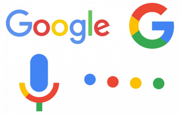
The giant Google decided to modernize its classic logo after 17 years of keeping it the same. The new update came this year with major changes in its typography. This new brand icon, flatter and closer than before, remains the corporate colors in all his letters. "We believe we took the best of Google (simple, neat, colorful, friendly) and remodel," said the company itself after the change.

Another company that recently decided to give a change of scenery to its brand logo is Quora. Since the last update, the company’s logo has a different typeface and spacing his letters, giving more distance between the 'r' and 'a', one of the problems of its former logo.

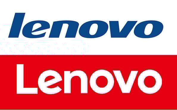
The technology company Lenovo has also completely changed the logo of the company, leaving the italic set allowing other background colors that do not necessarily have to be the previous corporate blue. The intention of its creators is to convey a more personal brand value and global reach.
Other substantial changes in a logo can be found in Flipkart. The company, in its latest update, decided to modernize its image by suppressing the shopping cart and replacing it with a bag to go buy. Moreover, it also changed the font of the letters and color.

This virtual reality device company has decided to delete the name of the company's logo and its distinctive eye. Now the logo Oculus is just a black box with an 'o' flattened at the center. The key to the new design of the logo, as the company explained, was the simplicity.

